
Little Green Light is a cloud-based donor management system for fundraisers.
Subscribe to get our latest product updates, best practices and tips to grow your nonprofit.
We’re excited to announce an update, including the addition of several graphs, to the Little Green Light Dashboard.
The graphs show aggregated gift and pledge data, and you can adjust the time frame and gift types to display. Updates to the dashboard also include greater display customization: You can now move the widgets to the left, right, or middle column, and you can resize them (depending on the minimum size required to display the widget).
This article provides a quick description of the 4 new LGL Dashboard graphs. At the end of the article, you can link to a video that shows the new dashboard in action.
Webinar: For a live walkthrough of the dashboard with Q&A, join our webinar on Wednesday, June 23, 2021. Click the image below to learn more and register:
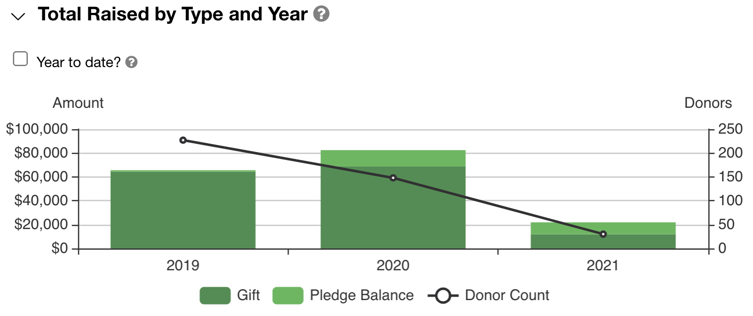
This graph lets you quickly see your full-year fundraising totals. It shows the total amount you’ve raised during the current and prior two years. As in all these graphs, total raised is the sum of gifts received (including pledge payments) and any open balances for pledges made during the period.
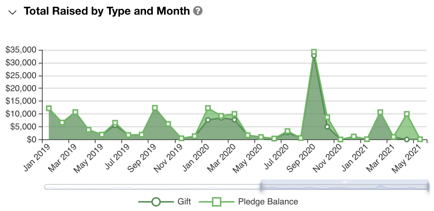
This graph helps you visualize your fundraising pattern over an extended period of time. It shows on a timeline how much you’ve raised by month. You can adjust the timeline bar to show several years of data at once.
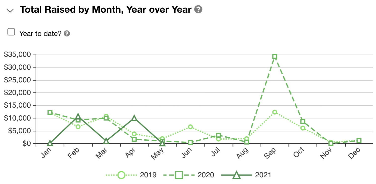
This graph helps you compare the pattern of your current year fundraising to that of the prior two years. Whereas the graph above is on a continuous timeline, this one shows the months of the year on the x-axis and then overlays your fundraising for the current and prior two years.
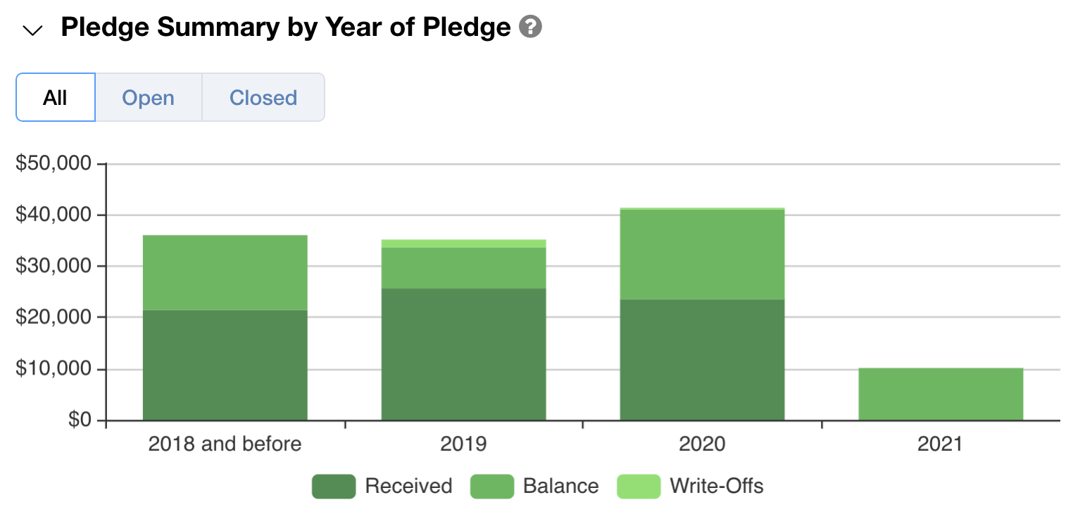
This graph lets you see at a glance how you’re doing in terms of pledge commitments and pledge payments. It shows the current and prior two years and also a lump sum for the years prior to that. All data is presented based on the year in which the pledge was made.
For a delightful walk-through of the LGL dashboard and how to customize it, please have a look at this short video:

Ready to try LGL? Get your first 30 days free. No credit card required.