
Little Green Light is a cloud-based donor management system for fundraisers.
Subscribe to get our latest product updates, best practices and tips to grow your nonprofit.
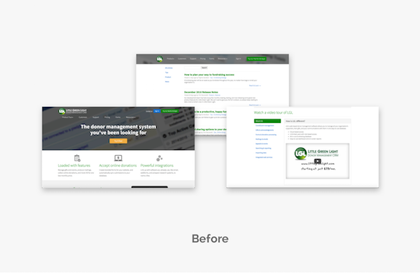
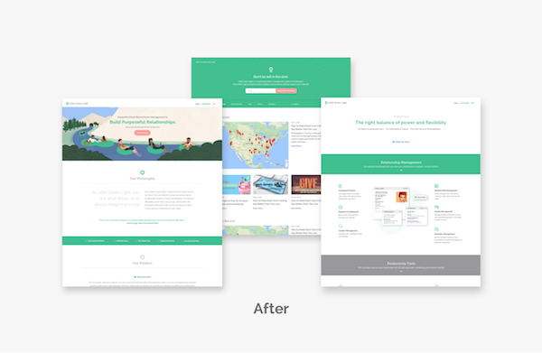
As you may have seen, we recently made some big changes to the Little Green Light website, logo and brand.
So why and how did we at Little Green Light go through all this change? Well, really, the “why” part is pretty simple… we wanted to more clearly present what Little Green Light is all about and what you can expect from us and our service. The “how” is a bit more involved. We thought you might be interested in hearing more about the why’s and the how’s behind our changes …
Successful companies usually present a strong identity and a recognizable brand. And brands are more than just a name or a logo. Think of Coke, Nike, and Apple. The most successful companies have a brand that resonates with their customers’ hopes and aspirations. They let you know how you’ll feel when you use their products.
And to be effective, your company or organization’s brand needs to be an honest representation of who you are; something that is quickly recognizable as you. That is what Little Green Light was striving for when we undertook a comprehensive re-branding process.
From Day 1, the team behind Little Green Light has been committed to providing nonprofits with a user-friendly, robust donor management system at an affordable price. 10 years and 3,000 customers later, that hasn’t changed. What we realized, however, was that our website and logo, and really our brand overall, didn’t relay that message as effectively as we wished.
For years, we’ve felt that we had not yet captured the essence of what makes Little Green Light special. We would hear it from customers who were loving their experience, that it was so “different” from what they’d used before, but we had difficulty translating that into a clear, succinct message that actually managed to get the meaning across.
Part of the problem was that we were so busy with our day to day work that we didn’t take the time to take a step back and put into words who we are and why we do what we do. Over the years, we made several attempts at redesigning our website, brainstorming new taglines, updating our marketing collateral, and even rolling out a new logo. The problem was that we did it in stages, each independent of the other and we lacked a cohesive, consistent look.
Through a small round of website testing we evaluated our effectiveness in communicating who Little Green Light was as a company, as a product and as a team. During the testing we asked site visitors to perform certain tasks and then asked them to answer some questions, such as how is Little Green Light different, is it a compelling site and how would they characterize the service. While site visitors were impressed with the offering, they didn’t feel that the website communicated the message very well — it was not easy enough to navigate or to find the information they wanted. We quickly realized we weren’t quite hitting the mark.
Soon after this testing, our Little Green Light team embarked on an enlightening journey to discover what was most important to us as a company (for both us as employees and for our customers) and to think about how to relay that effectively to our users. After a day-and-a-half long retreat, our team collaborated and drafted a brand and positioning statement that guided our future changes to the website and logo.
Our next step was to take what we had brainstormed and put it into action. For us, that meant re-visiting our website’s look and feel, its content, and all the ways our company was publicly represented to ensure we had consistency with our message across all our marketing channels. Given our small team, that was a difficult task for us to complete on our own, so we sought a firm that could take the branding work we had begun and turn that into a new logo and website.
After an extensive search, our team identified a design firm who we believed could help us craft our message and deliver the unique look we were striving for. After lots of brainstorming and actively listening to each other, we successfully defined our company’s voice and with the help of our designer were able to create a site that allowed that voice to shine through. One particular exercise proved especially helpful in defining our voice: selecting our company’s archetype. Once we identified the archetypes that fit us and our customers best, we were then able to create the look and the content that aligned with that voice. Can you guess which archetype(s) Little Green Light identified with the most?
We put a lot of thought into the development of our new logo. We wanted it to portray what you can expect from Little Green Light – from the product itself, from our company, and from our team. Little Green Light is focused on three things: People, data, and simplicity. We believe in the work you do and know the important role data plays in your success. Our new logo emphasizes our commitment to building and supporting a product that helps transform the way you work.
![]()
First, we purposely chose a single color and a simple design to reduce the complexity that a full-color, multidimensional logo can portray. When we paired that with a more streamlined website design, and incorporated more whitespace on the page, we were able to let the simplicity of the logo and the design show through, making it more representative of the clean layout and design of our software. The shape of the logo is reminiscent of a person, which really resonated with our team. It’s in our DNA to help you succeed. (That’s why we built Little Green Light.) Lastly, the circle component reminds us of a light, one that’s guiding you through your mountain of data. That’s it – people, data, and simplicity. It’s what Little Green Light is all about!
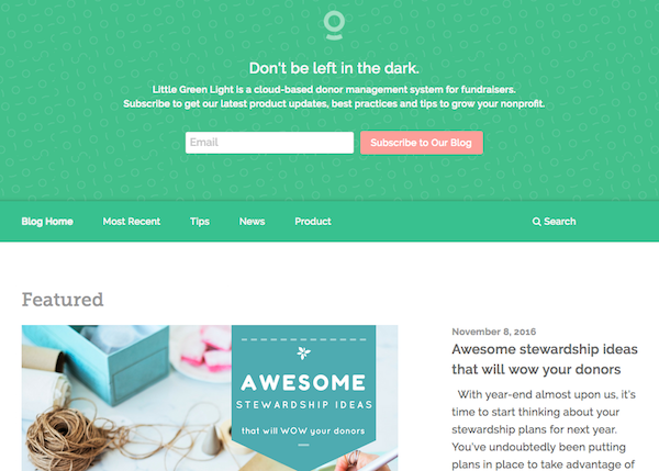
We’ve made some substantial updates to our blog to reflect our commitment to providing you with the content you need to do your job more effectively. From offering fundraising tips and best practices articles to sharing product news and feature updates, this is your go-to resource for the most up-to-date news from Little Green Light. Check out some of the new features you’ll see:
We look forward to continually developing our platform to help you be more successful in your fundraising efforts. You are what drives us to always keep improving. Let us know how we’re doing!
Note: We would not have been successful without the help of some very talented people. We want to give a big shout out to those who lent their expertise to help us to more effectively tell the Little Green Light story: Jonathan Maimon at JM UX Design, Mandy Levenberg at Lev Strategies and Kari Kay at PLOT Creative Studio.

Comments are closed.
Comments are closed.
Ready to try LGL? Get your first 30 days free. No credit card required.
Chris, Nick, and Timi,
Great job. The product is top notch. And, now, you’re matching it with improved branding.
Onward and upward!
Great to see “continual improvement” put into practice.
Best wishes for continued growth.
Hi Al,
We so appreciate your comments! Hope to see you soon!
Timi
Hi Timi and all at LGL!
I read this article with much interest as the non-profit I head, Sant Bani School in Sanbornton, NH, has done a good deal of work in the last couple of years around mission, core values, branding and strategic planning. Kudos to you all for doing this! Love the new logo (and appreciated the explanation of aspects of it very much). What I got most of all from reading this was the passion for LGL that I know you all have. Keep up the great work! (and I apologize for way too many exclamation points!!!). 😉
Thanks, Kent!I, too, am a fan of exclamation points!All kidding aside, I appreciate hearing that our passion comes through.