
Little Green Light is a cloud-based donor management system for fundraisers.
Subscribe to get our latest product updates, best practices and tips to grow your nonprofit.
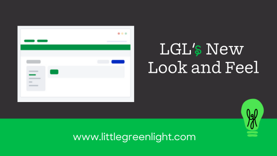
We’re excited to announce that LGL has a fresh new look available. This is like a new coat of paint, not a complete remodel. You shouldn’t feel lost at all; we’re just updating the colors and spacing, not how pages function or the navigation options. In the next several months, we will be moving all accounts to this new look. But you can get a head start by turning on the new look now.
Before sharing the details of the new look, we’d like to briefly explain our motivation for making this update. The primary objective is to make the LGL service even easier to use. As a data-intensive application, there is a lot of information on the screen and we wanted to help make it easier on the eyes. That meant adding a bit more spacing and brighter color options, including a new high-contrast black option.
Often when you make a change it takes a short period of adjustment, because you’re so used to the old way. That could be the case with this change as well, but for those of us who’ve been using it for a while during internal testing, we are confident in saying that you’ll start to like it quickly and not want to go back.
Importantly, you can still keep the exact color you are currently using for your account, in which case you are just getting the benefit of a bit better spacing and use of fonts with no change to the color scheme.
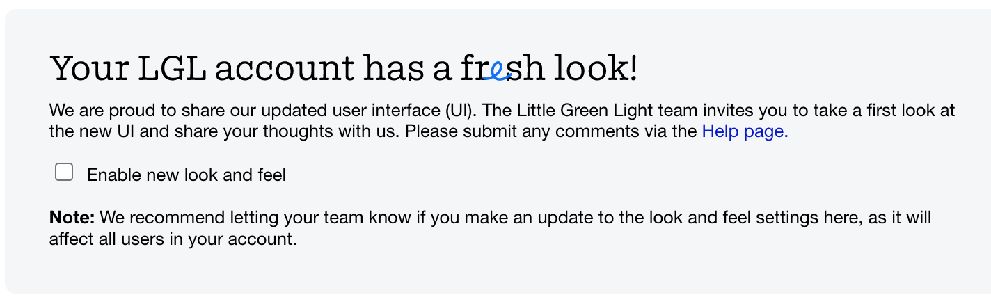
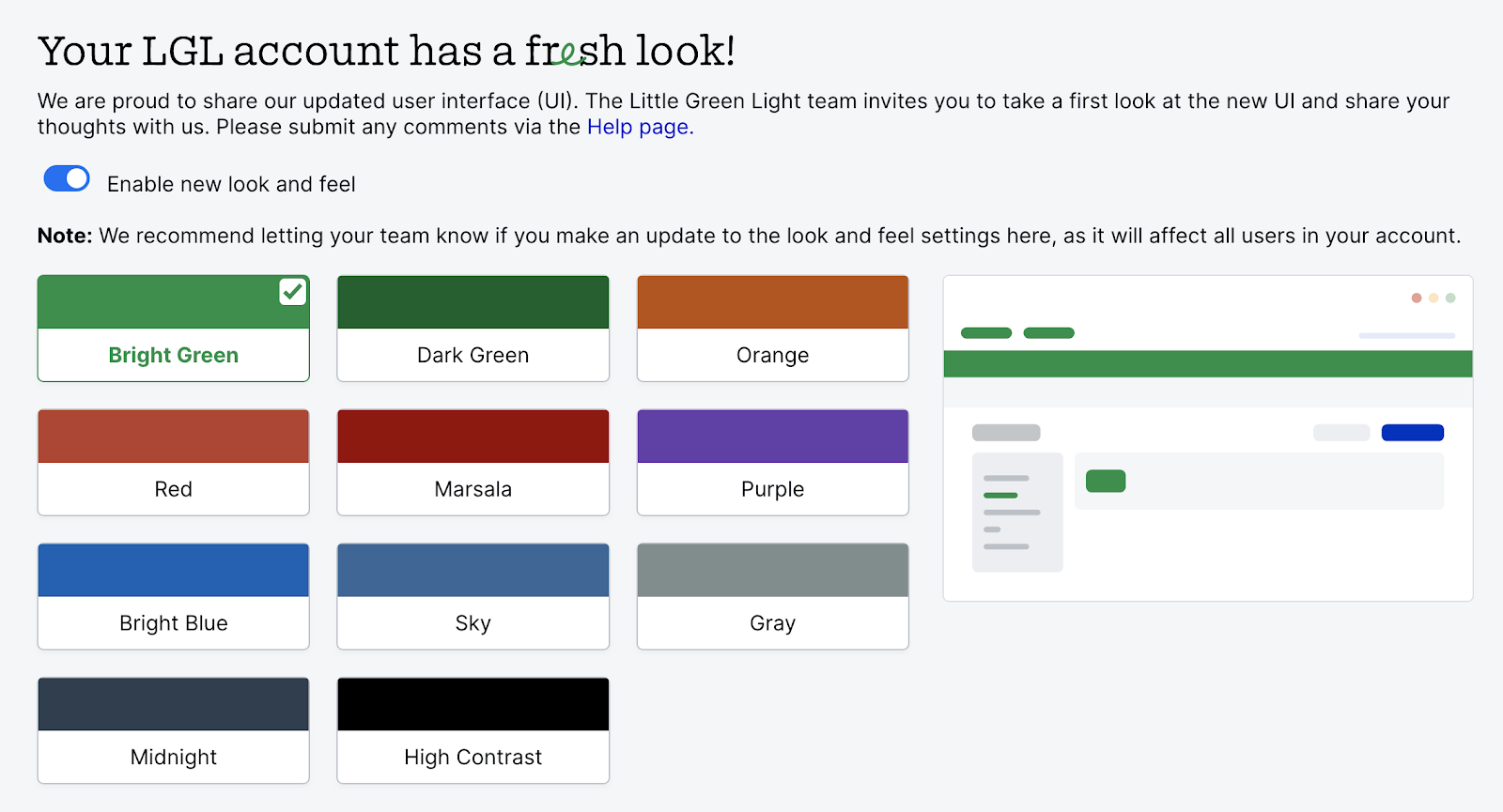
To activate the new look in your LGL account, go to Settings > Subscription Settings > Look & feel. You’ll see a box you can check to turn it on. Remember to click the “Save updates” button in the upper right of that page after making your selection.
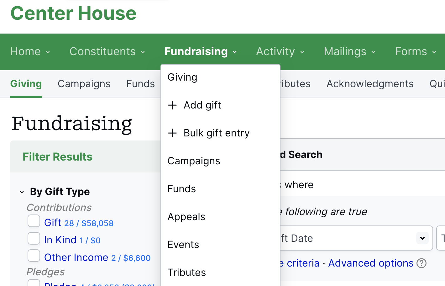
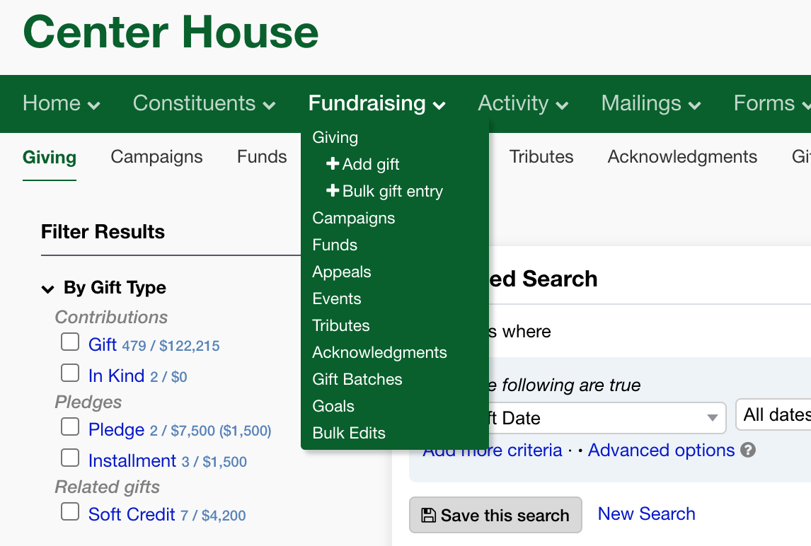
There are now five additional color choices for your account. The new colors are brighter, and we have added a purple option as well as a dark higher contrast option. The previous colors are all still supported.
The new styling of the navigation is lighter and has more breathing room.
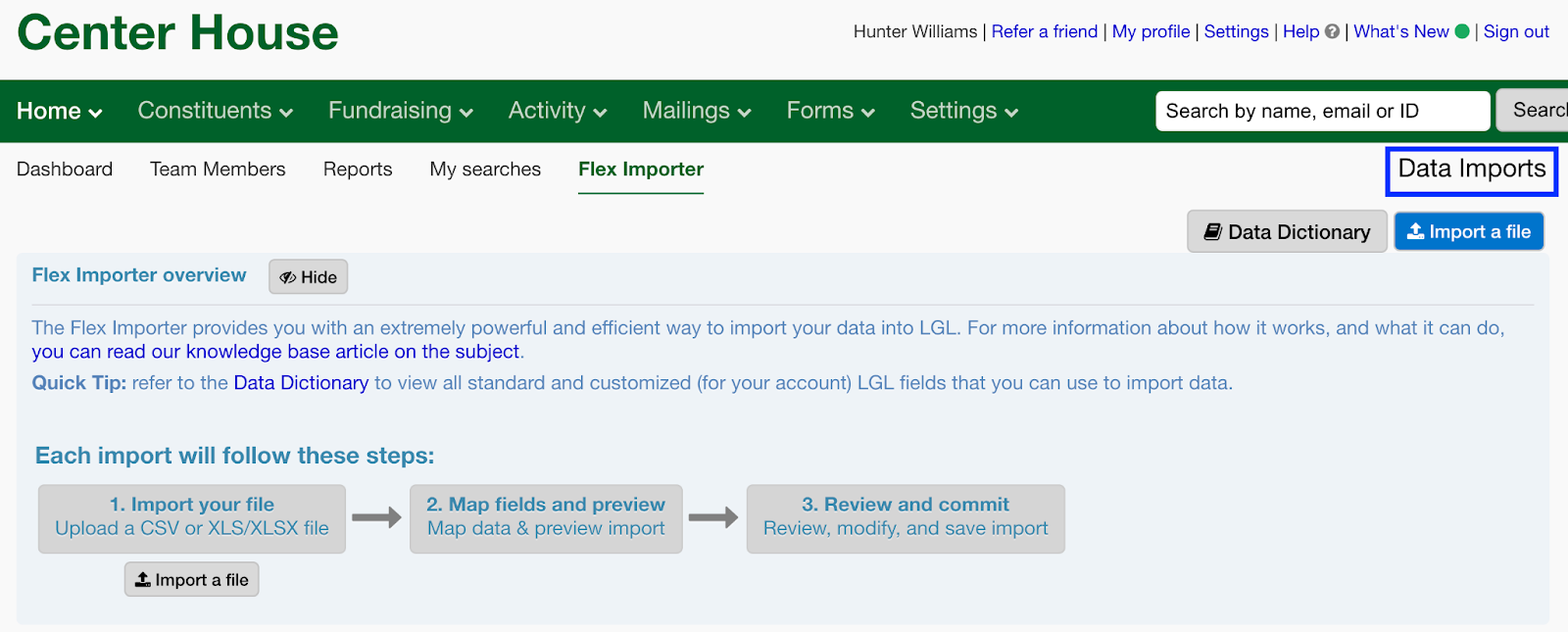
Another change is that we are moving page titles from the right side of the page to the left and making a few other style changes, such as what is shown here on the Flex Importer page.

Again, you can turn on this new look in Settings > Subscription Settings > Look & feel. Remember to click the “Save updates” button in the upper right of that page after making your selection.
If you would like to share any feedback on this update, please use the Help page in your LGL account (the link is in the top right corner of every page).
We hope you enjoy the new look!

Comments are closed.
Comments are closed.
Ready to try LGL? Get your first 30 days free. No credit card required.
I haven’t tried the new option yet because I’m not looking forward to having more space because that means less information on the screen, more scrolling, harder to find.
Hi Elizabeth,
We’d encourage you to give it a try. We think the extra spacing helps with making information be more accessible. If you wish, you can revert back to the old version if you’d like.
New look seems OK but will bigger fonts and more white space cause extra scrolling? And if we select it, can we revert back?
The spacing difference should not cause much more scrolling. We hope it will just provide a bit more clarity of content. And, yes, you can choose to revert back if you wish.