
Little Green Light is a cloud-based donor management system for fundraisers.
Subscribe to get our latest product updates, best practices and tips to grow your nonprofit.
Over the last several months, we’ve been working hard on some updates to Little Green Light’s brand. With the help of the incredible design folks at Pentagram, we’ve re-designed our logo, selected new brand colors and typography, added a new tagline, and applied it all to our website and marketing materials.
Today, we are thrilled to introduce you to our new look and share some of what we hope our new brand will convey.
When we embarked on this journey, we initially focused primarily on our logo. Although we loved our former mark, there were a few things we wanted that mark to relay that we felt were missing. The first was to make it more recognizable and distinct. We wanted it to relay a warm, friendly feel but not to appear too intricate or complicated. We were torn between using our full name in the logo or just our nickname, because everyone who knows us calls us “LGL.” In the end, we got both!
We now have two beautiful versions of our logo, each of which complements the other. We will use them both, but not right next to each other: They are meant to work in conjunction with, but not alongside, one another.
The first logo features our acronym, LGL, as a filament inside a green, stylized Edison-style lightbulb:
![]()
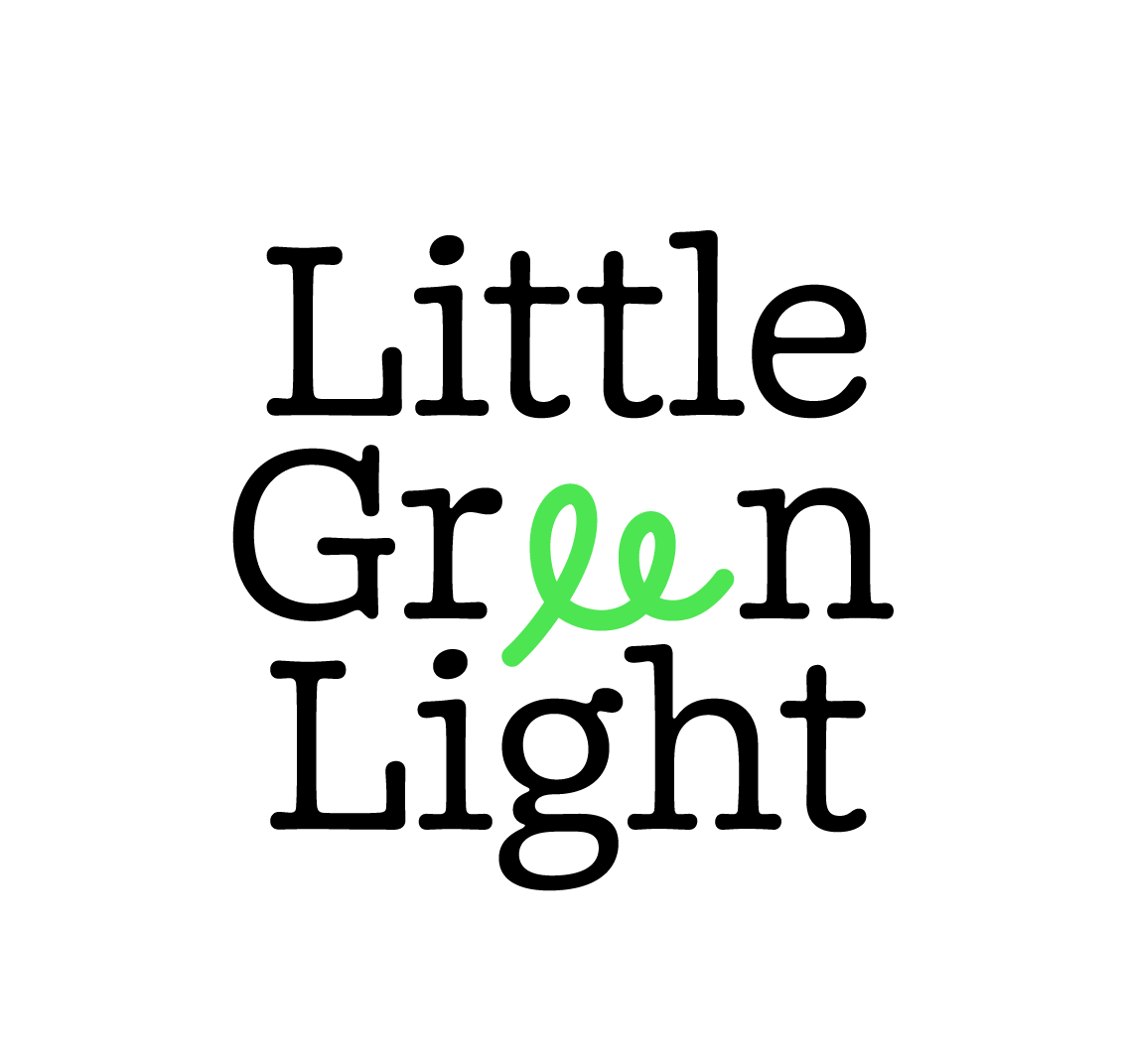
The second is a stacked wordmark logo featuring our company name, with a custom glyph element to make it pop:
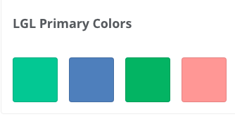
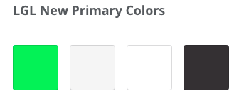
As the new logo began to take shape, we also recognized a need to take a closer look at our brand colors and the types of fonts we used. The new wordmark and logo really helped drive this choice.
We transitioned from more muted shades to bolder, brighter ones, which not only brought more “light” to our look but also made our content more readable.
Primary Brand colors (before and after)
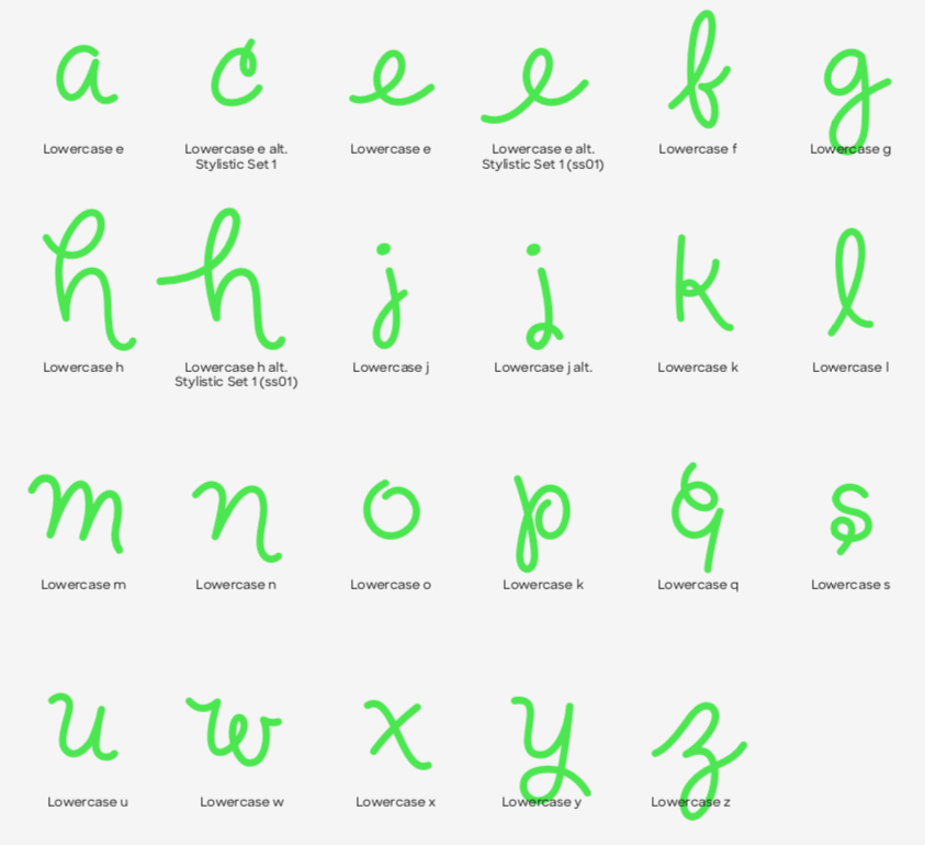
We incorporated the friendly, Doyle Light typeface in headlines, along with the supporting typeface Sharp Sans for body copy. We also added a custom alphabet made of select letters composed of curves based on the architecture of the logos. All of this added even more uniqueness to our brand.
Our new custom alphabet:
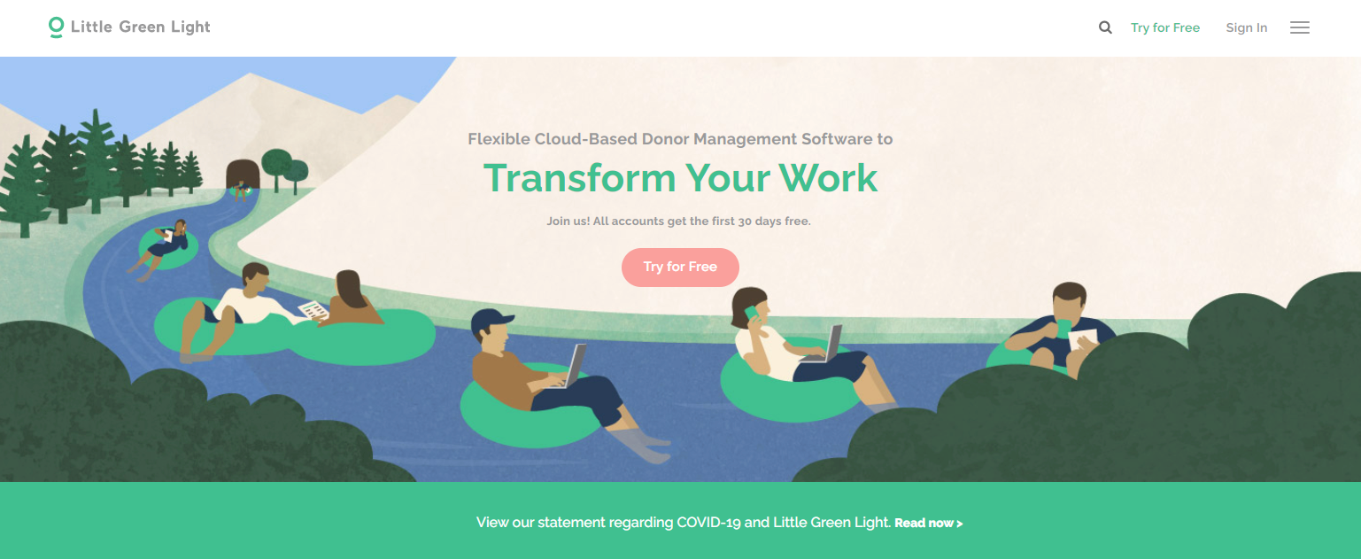
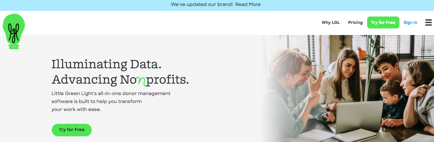
Although there has been little change in content on our Little Green Light website, we have made some big changes to the home page, both in its look and feel and in the navigation style. We’ve incorporated photographs in lieu of illustrations to the top of our home page, and introduced a new tagline, Illuminating data. Advancing Nonprofits. Our intention with these changes is to bring a more “human” element to our brand and better represent the types of customers we serve.
Former home page style:
New home page style with new tagline:
We hope you enjoy our brand’s bolder, cleaner, more human look. Feel free to drop us a comment and let us know what you think!

Comments are closed.
Comments are closed.
Ready to try LGL? Get your first 30 days free. No credit card required.
Love the new rebranding and the colour scheme! Great job!
Do you know if any of the similar feel, style, and modern look will be brought to the CRM?
Hi Taylor!
Thanks so much! We don’t have any plans in the works regarding the app – YET!
Sincerely,
Timi
I really like the rebranding. Especially the lightbulb logo! Very creative and effective.
Love your new branding! Great work done!
Absolutely love the new look guys! As a 3.5 year LGL user, I enjoy the updates and re-branding. I think more people need to know how good LGL really is! Thank you for everything!
Timi —
Wonderful work. Goodness it has been such a long-time since I met you and moved my non-profit to LGL … and have since moved 2 more.
I continue to like the intuitiveness of the program … and appreciate the continuous updates. The branding piece is well done.
If you would like to call me at 717.319.4782 — I would love to talk to you about the industry I am currently in and some opportunities to grow in this niche market.
Thanks for the ease, cost and simplicity of learning your program. I am not sure if you have had as many direct and indirect referrals from anyone else!!!
Blessings –
Love the new branding! It make total since with the lightbulb. I do appreciate you sharing all the details and reasons behind the new brand. Thank you!
Love the new lightbulb logo – well done!
thanks, looks grat!! I love the little lgl in the light bulb too, very clever! cheers, erica
Such a fun light bulb logo. A very well thought-out branding update!
Looks great. I love the new colors. They really pop!
Great job.
LOVE the new green light logo, as well as the new tagline!
Love the rebranding! Thanks for sharing the process – (letting us know that your site wasn’t hacked!)
Speaking of security, my board asked about your data protection. How often is our data (stored with you) backed-up, and is there multiple back-up sites? Is there any need for us to back-up locally?
Congratulations – and THANK YOU!
Hi Karen,
Glad to hear you like the new brand! You can read up all about our Security here: https://www.littlegreenlight.com/security/. All customer data is backed up daily and stored on multiple servers for redundancy.There is no need to store any backups locally, but you are welcome to, if you’d like!
Thanks,
Timi