
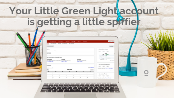
Little Green Light is a cloud-based donor management system for fundraisers.
Subscribe to get our latest product updates, best practices and tips to grow your nonprofit.
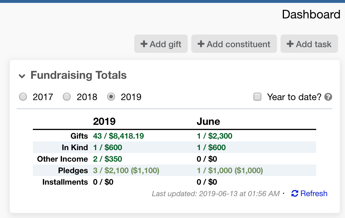
We’re thrilled to announce that next weekend, July 6-7, all Little Green Light accounts will receive a lightly updated look and feel. These changes will automatically apply to all accounts and users will not need to take any action.
Our intention with the changes is to make the service more readable, with more breathing room, lighter shading, and more consistent use of fonts and spacing. We’re also adopting some more modern styling—3D buttons are so 2009!
We make every effort to roll out changes to LGL in a thoughtful manner, and this one is no exception. As part of the process, we selected a new service for building our application pages. While this gives us a lot of new capabilities, we are purposely starting with a modest set of changes that will not feel too jarring. As with any other LGL updates that are visible to a large number of our customers, we ran this new look by a subset of users who tested it out and provided valuable feedback (thanks!). We incorporated much of the feedback in the final version.
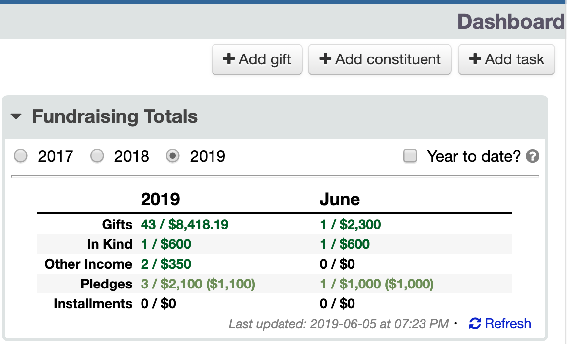
We hope users will enjoy these updates to the look and feel of their LGL accounts. The updates are part of our continuing efforts to improve the usability of the software.
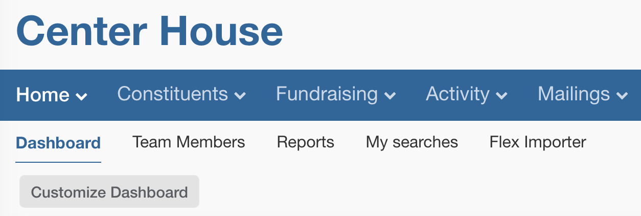
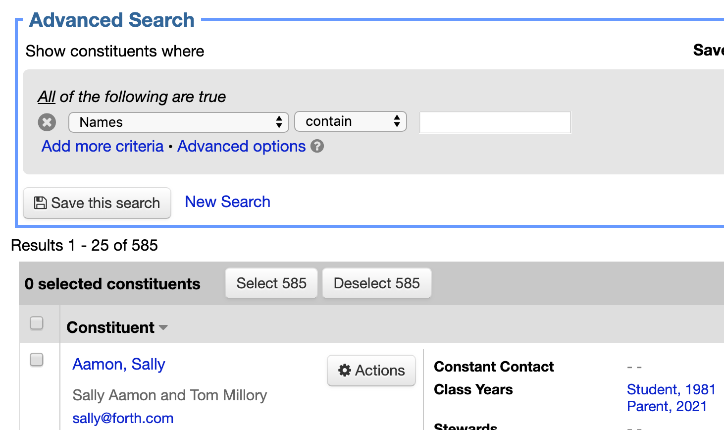
Before |
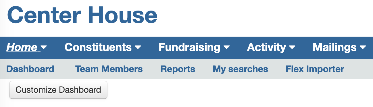 |
AfterPrimary navigation is no longer all bold text, and buttons are flatter. Light gray background is easier on the eyes than the previous all-white background. |
 |
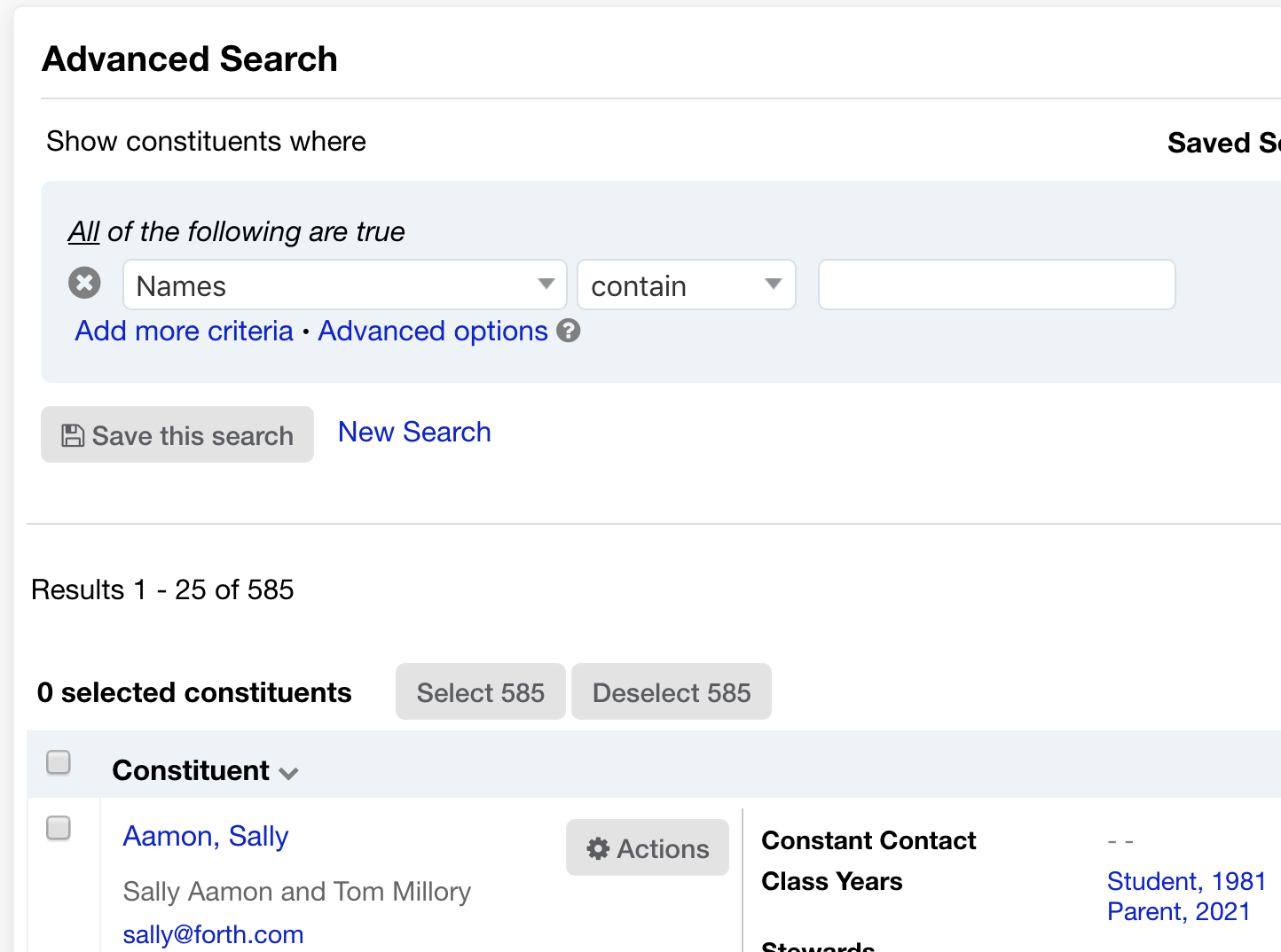
Before |
 |
AfterShaded section headings are lighter, and buttons are flatter. |
 |
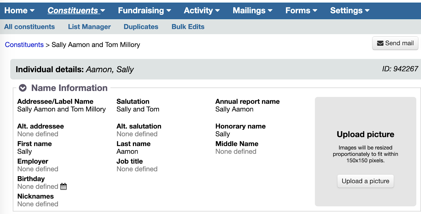
Before |
 |
AfterShaded section headings are lighter, and buttons are flatter. |
 |
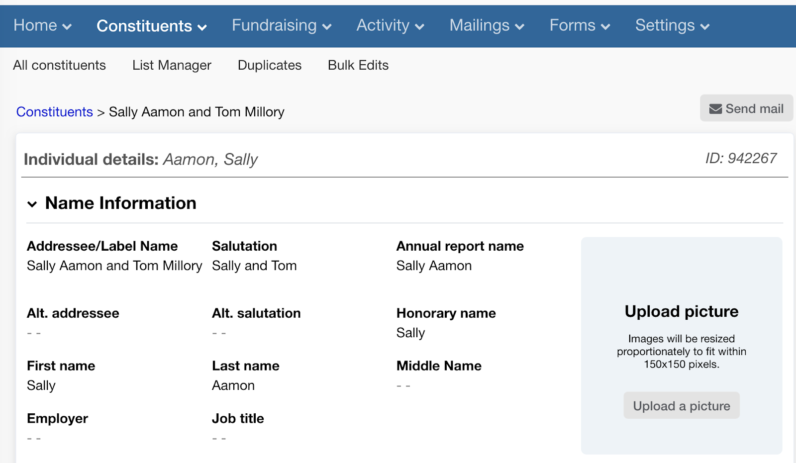
Before |
 |
AfterShading is lighter, and bold text has less weight. |
 |
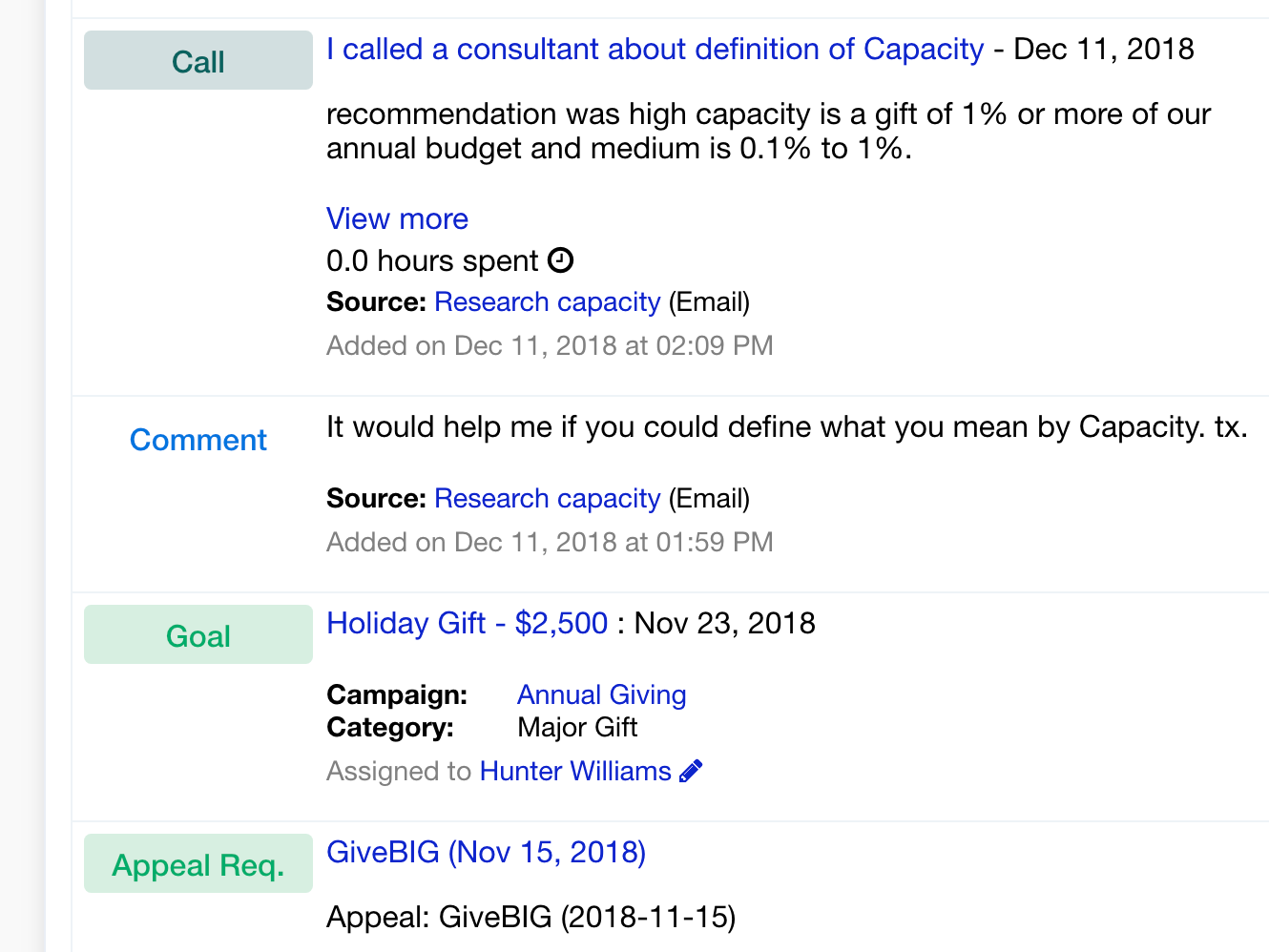
Before |
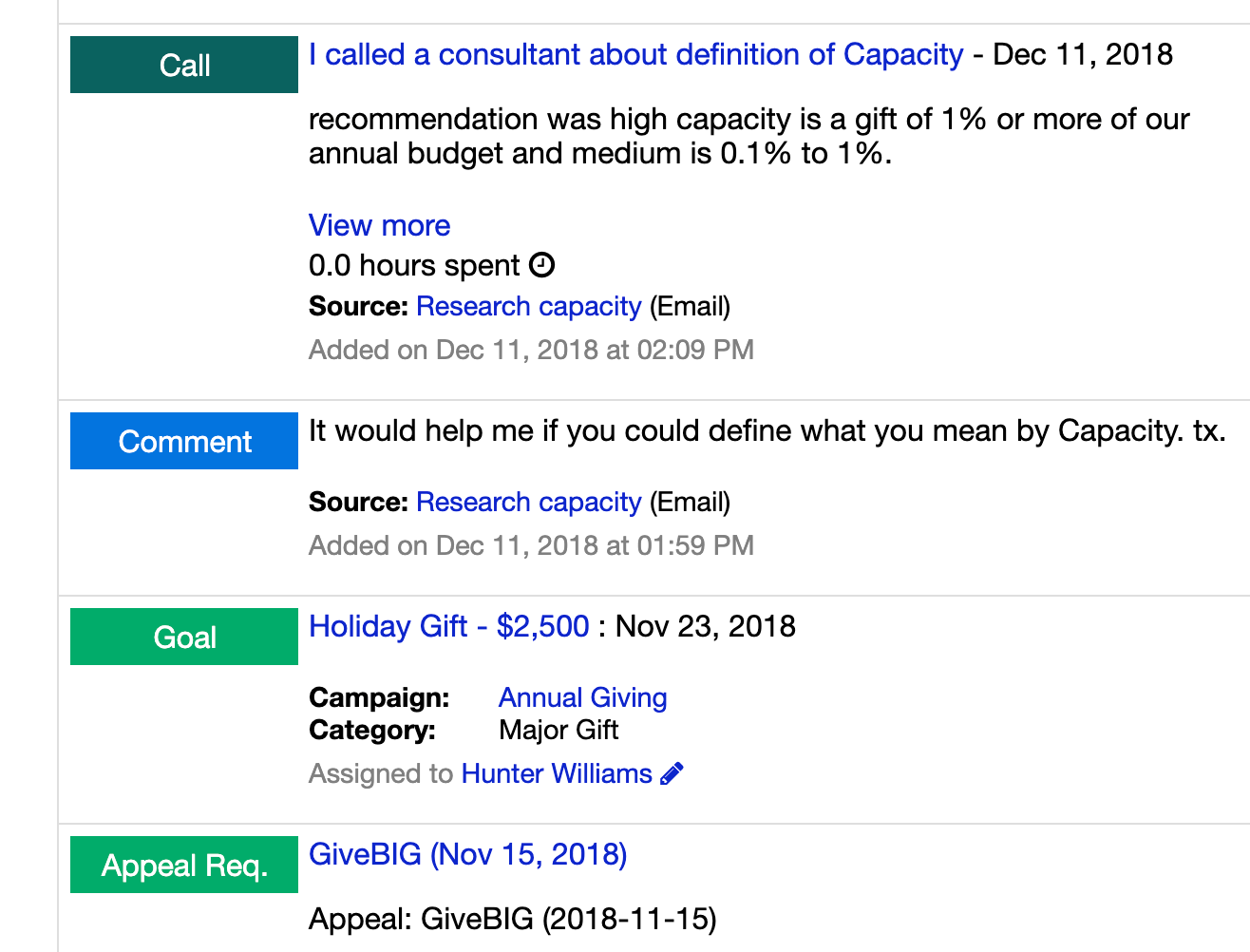 |
AfterIn eIn each constituent’s Activity History, the shading of the boxes is lighter, so they look less like a clickable button and more like an information tag. |
 |
And as a reminder, these updates will go live over the weekend of July 6-7.

Comments are closed.
Comments are closed.
Ready to try LGL? Get your first 30 days free. No credit card required.
Seems easier on my eyes, but time will tell. Please look into my request for Mailing Type issues. I try to run a report for a mail out of our newsletters for BLANK only mailing status. It would not let me. This is a vital part of our mailing system. I was absent and someone else did our newsletter mail out and only PRIMARY was mailed. I thought well let me go in and get our BLANK. I noticed in the MAILING TYPE drop down the word BLANK is not written. The space is only blank. Maybe this is not communicating with the word typed BLANK. When our system was downloaded no mailing types were forwarded. I have since changed many as donations/dues/ in kind/memorials were received. Also in the setting up of name address etc, mailing type is listed but when i ran it all “0” appeared, not the mailing types. Thank you!
Hi Sharon,
Thanks for the feedback on our UI updates. Have you submitted your suggestion for Mailing types to our support team? If not, please do so we can follow up with you there.
Sincerely,
Timi
It does look better but on certain pages there now looks like there is more white space not utilized. Please look at the Bulk Editing page – data entry section (not default information section) the Gift and Deposit Dates are cut off so not one can’t see the day of the month. I have a file that I can send if necessary.
Hi Amy,
Thanks for the feedback. I’ve shared this with our tech team for their review.
Sincerely,
Timi
I just wish you would let us sideload our own CSS. At least to make it mobile friendly.
Beatrix,
Thank you for the suggestion. I’ve shared it with our tech team for consideration.
Sincerely,
Timi
I preferred the look prior to the change. I preferred the contrast and 3D buttons; it made seeing things at a quick glance much easier.
Hi Tamre,
Thank you for providing feedback. Our team has enabled a new setting that you can request that offers a version of the UI that has more of the original contrast. You can request that version using the form located on the Help page in your LGL account.
Timi
Do not like the new view. Makes it harder to see on the screen. Not enough shading, softer fonts, less boxes makes every day with the database more difficult, not easier, at least for me.
Just saying…. appreciate the effort but wish this was an optional setting 🙂
Petra
Hi Petra,
Thank you for providing feedback. Our team has enabled a new setting that you can request that offers a version of the UI that has more of the original contrast. You can request that version using the form located on the Help page in your LGL account.
Timi
I echo Kathryne James’s comment above – I find the changes very hard on the eyes. There’s too much white space and not enough differentiation between different sections of content – everything just recedes into the background and becomes a big wall of text.
Hi Rhonda,
Thank you for providing feedback. Our team has enabled a new setting that you can request that offers a version of the UI that has more of the original contrast. You can request that version using the form located on the Help page in your LGL account.
Timi
Looks good — cleaner! Thanks for all the great work you folks do!
It would be great if we could individually customize the display. When I make a change, it changes everyone’s in my organization.
Hi Carrie,
Thanks for the suggestion. I’ve shared your comments with my team.
Timi
Love the new UI!
Is there any way to opt out of the updates? I agree with the previous comment regarding “older” eyes. I appreciate Bold type and darker shading.
Hi Peg,
Thank you for providing feedback. Our team has enabled a new setting that you can request that offers a version of the UI that has more of the original contrast. You can request that version using the form located on the Help page in your LGL account.
Timi
Looks even better than I expected – thank you!
Looking forward to the changes. Definitely a more contemporary look and feel…thanks!
Thanks, Indira! The changes went live over the weekend!
Timi
Hi, I will wait for the roll out to fully comment, but the samples are not as friendly to older folks (like me). Older eyes often find subtle shading and lighter colors harder to see. For instance, the gray type in this com box is really difficult for me. Not a deal breaker, but will be interesting to see the responses.
Hi Kathryne,
Thanks for the feedback. The changes went live over the weekend. If you find you are having an difficulty with reading your screen with the updates, please be sure to send a note to our support team by using the Contact form located on the Help page in your LGL account.
Sincerely,
Timi
I share your experience with the direction many (italicized) cloud based services are headed: Less definition to sections, words floating on a white field, smaller, more gray fonts, etc. This trend feels very inclined to younger people’s brains and eyes.
It would benefit LGL to provide users with “accessibility options” to use former design that are easier to see and use for some of us us.
Thank you.
Hi David,
Thank you for providing feedback. Our team has enabled a new setting that you can request that offers a version of the UI that has more of the original contrast. You can request that version using the form located on the Help page in your LGL account.
Timi
The changes are subtle but probably a step forward. I would like to suggest another change. While doing a search, it would be wonderful if the categories could be in alphabetical order. It seems random now, and requires a long scroll to find the correct one.
Hi Didi,
Thanks for the feedback and the suggestion. You are able to re-order your categories currently. This article from our Knowledge Base shares how: https://help.littlegreenlight.com/article/395-customizing-the-order-and-display-of-your-constituent-menu-items
Hope this helps!
Timi
Yes, Didi! We’ve asked LGL about this for two years now. it would be SOOOOO helpful. Is it too much to ask?
These changes are very subtle and attractive. Thanks for the continuous improvement.
Thanks, Lili!
We’re most of the way through our 30-day trial. One of my reactions to LGL was how cluttered the constituent page looked. It was really hard to see the person’s name at a glance for example because nothing made it stand out.
What you’ve done here is an improvement. Thank you.
Sophie, thanks for the feedback! Glad you see an improvement!
Excellent work on the changes. A welcome improvement.
Thanks, Reese!
This all looks excellent and our EYES thank you! #flatbuttonsarein!
Thanks, Lisa! Indeed, flat buttons are the bomb!
Updates are very much appreciated … subtle … but, effective. Look forward to seeing them apply to my account.
thanks.
Jill, glad to hear you like them!